The systematic collection and arrangement of numerical facts or data of any kind;
(also) the branch of science or mathematics concerned with the analysis and interpretation of numerical data and appropriate ways of gathering such data. [OED]
2017-01-17
Statistics
Why statistics?
- Can tell you if you should be surprised by your data
- Can help predict what future data will look like
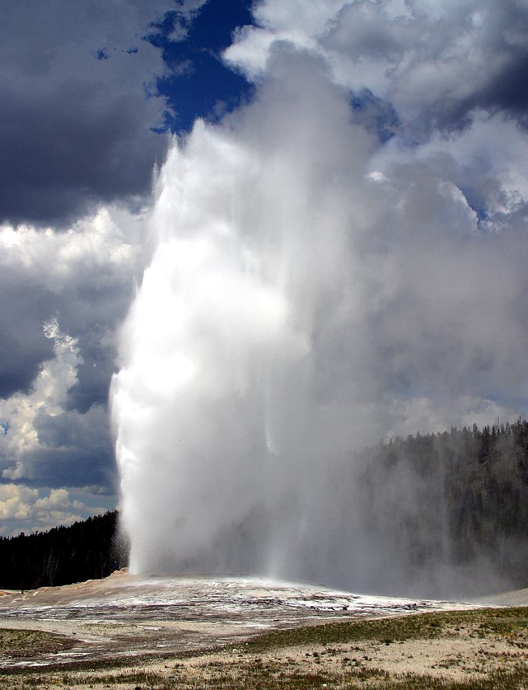
Data
## We'll use data on the duration and spacing of eruptions
## of the old faithful geyser
## Data are eruption duration and waiting time to next eruption
data ("faithful") # load data
str (faithful) # display the internal structure of an R object
## 'data.frame':    272 obs. of  2 variables:
##  $ eruptions: num  3.6 1.8 3.33 2.28 4.53 ...
##  $ waiting  : num  79 54 74 62 85 55 88 85 51 85 ...
Data summaries
A "statistic" is a the result of applying a function (summary) to the data: statistic <- function(data)
E.g. ranks: Min, Quantiles, Median, Mean, Max
summary (faithful$eruptions)
##    Min. 1st Qu.  Median    Mean 3rd Qu.    Max.
##   1.600   2.163   4.000   3.488   4.454   5.100
Roughly, a quantile for a proportion \(p\) is a value \(x\) for which \(p\) of the data are less than or equal to \(x\). The first quartile, median, and third quartile are the quantiles for \(p=0.25\), \(p=0.5\), and \(p=0.75\), respectively.
Visual Summary 1: Box Plot
boxplot (faithful$eruptions, main="Eruption time", horizontal=T)

Visual Summary 1.5: Box Plot, Jitter Plot
library('ggplot2');library(gridExtra); #boxplot relatives
b1<-ggplot(faithful, aes(x="All",y=eruptions)) + labs(x=NULL) + geom_boxplot()
#jitter plot
b2<-ggplot(faithful, aes(x="All",y=eruptions)) + labs(x=NULL) +
    geom_jitter(position=position_jitter(height=0,width=0.25))
grid.arrange(b1, b2, nrow=1)

Visual Summary 2: Histogram
## Construct histogram of eruption times, plot data points on the x axis
hist (faithful$eruptions, main="Eruption time", xlab="Time (minutes)",
      ylab="Count")
points (x=faithful$eruptions,y=rep(0,length(faithful$eruptions)), lwd=4, col='blue')

Visual Summary 2.5: Histogram
## Construct different histogram of eruption times
ggplot(faithful, aes(x=eruptions)) + labs(y="Proportion") + geom_histogram(aes(y = ..count../sum(..count..)))

Visual Summary 3: Empirical Cumulative Distribution Function
## Construct ECDF of eruption times, plot data points on the x axis
plot(ecdf(faithful$eruptions), main="Eruption time", xlab="Time (minutes)",
      ylab="Proportion")
points (x=faithful$eruptions,y=rep(0,length(faithful$eruptions)), lwd=4, col='blue')

Visual Summary 3.5: Empirical Cumulative Distribution Function
## Different picture of ECDF, with jitter plot
ggplot(faithful, aes(x=eruptions)) + labs(x="Eruption Time",y="Proportion") +
    stat_ecdf() + geom_jitter(aes(y=0.125),position=position_jitter(width=0,height=0.1))

Replicates
- Common assumption is that data consists of replicates that are "the same."
- Come from "the same population"
- Come from "the same process"
- The goal of data analysis is to understand what the data tell us about the population.
Randomness
We often assume that we can treat items as if they were distributed "randomly."
- "That's so random!"
- Result of a coin flip is random
- Passengers were screened at random
- "random" does not mean "uniform"
- Mathematical formalism: events and probability
Sample Spaces and Events
- Sample space \({\mathcal{S}}\) is the set of all possible events we might observe. Depends on context.
- Coin flips: \({\mathcal{S}}= \{ h, t \}\)
- Eruption times: \({\mathcal{S}}= {\mathbb{R}}^{\ge 0}\)
- (Eruption times, Eruption waits): \({\mathcal{S}}= {\mathbb{R}}^{\ge 0} \times {\mathbb{R}}^{\ge 0}\)
- An event is a subset of the sample space.
- Observe heads: \(\{ h \}\)
- Observe eruption for 2 minutes: \(\{ 2.0 \}\)
- Observe eruption with length between 1 and 2 minutes and wait between 50 and 70 minutes: \([1,2] \times [50,70]\).
Event Probabilities
Any event can be assigned a probability between \(0\) and \(1\) (inclusive).
- \(\Pr(\{h\}) = 0.5\)
- \(\Pr([1,2] \times [50,70]) = 0.10\)
Probability
- (OED) Math. As a measurable quantity: the extent to which a particular event is likely to occur, or a particular situation be the case, as measured by the relative frequency of occurrence of events of the same kind in the whole course of experience, and expressed by a number between 0 and 1.
- An event that cannot happen has probability 0; one that is certain to happen has probability 1. Probability is commonly estimated by the ratio of the number of successful cases to the total number of possible cases, derived mathematically using known properties of the distribution of events, or estimated logically by inferential or inductive reasoning (when mathematical concepts may be inapplicable or insufficient).
Axioms of probability
\(\Pr\) is a probability function over \(\mathcal{S}\) iff
- For all events \(A\), \(\Pr(A) \in {\mathbb{R}}\), \(\Pr(A) \ge 0\)
- \(\Pr(\mathcal{S}) = 1\)
- If \(A_1\), \(A_2\), … are disjoint, then
\(\Pr(\bigcup\limits_{i = 1}^{\infty} A_i) = \sum\limits_{i=1}^{\infty} \Pr(A_i)\)
Interpreting probability:
Objectivist view
- Suppose we observe \(n\) replications of an experiment.
- Let \(n(A)\) be the number of times event \(A\) was observed
- \(\lim_{n \to \infty} \frac{n(A)}{n} = \Pr(A)\)
- This is (loosely) Borel's Law of Large Numbers
(The more correct statment of this is coming up in a few slides.)
Subjective interpretation is possible as well. ("Bayesian" statistics is related to this idea – more later.)
Abstraction of data: Random Variable
- We often reduce data to numbers.
- "\(1\) means heads, \(0\) means tails."
A random variable is a mapping from the event space to a number (or vector.)
Usually rendered in uppercase italics
\(X\) is every statistician's favourite, followed closely by \(Y\) and \(Z\).
"Realizations" of \(X\) are written in lower case, e.g. \(x_1\), \(x_2\), …
We will write the set of possible realizations as: \(\mathcal{X}\) for \(X\),
\(\mathcal{Y}\) for \(Y\), and so on.
Distributions of random variables
Realizations are observed according to probabilities specified by the distribution of \(X\)
Can think of \(X\) as an "infinite supply of data"
Separate realizations of the same r.v. \(X\) are "independent and identically distributed" (i.i.d.)
Formal definition of a random variable requires measure theory, not covered here
Probabilities for random variables
Random variable \(X\), realization \(x\).
- What is the probability we see \(x\)?
- \(\Pr(X=x)\), (if lazy, \(\Pr(x)\), but don't do this)
- Subsets of the domain of a random variable correspond to events.
- \(\Pr(X > 0)\) probability that I see a realization that is positive.
Discrete Random Variables
- Discrete random variables take values from a countable set
- Coin flip \(X\)
- \(\mathcal{X} = \{0,1\}\)
- Number of snowflakes that fall in a day \(Y\)
- \(\mathcal{Y} = \{0, 1, 2, ...\}\)
- Coin flip \(X\)
Probability Mass Function (PMF)
- For a discrete \(X\), \(p_{X}(x)\) gives \(\Pr(X = x)\).
- Requirement: \(\sum_{x \in \mathcal{X}} p_{X}(x) = 1\).
- Note that the sum can have an infinite number of terms.
Probability Mass Function (PMF) Example
\(X\) is number of "heads" in 20 flips of a fair coin
\(\mathcal{X} = \{0,1,...,20\}\)

Cumulative Distribution Function (CDF)
- For a discrete \(X\), \(P_{X}(x)\) gives \(\Pr(X \le x)\).
- Requirements:
- \(P\) is nondecreasing
- \(\sup_{x \in \mathcal{X}} P_{X}(x) = 1\)
- Note:
- \(P_X(b) = \sum_{x \le b} p_X(x)\)
- \(\Pr(a < X \le b) = P_X(b) - P_X(a)\)
Cumulative Distribution Function (CDF) Example
\(X\) is number of "heads" in 20 flips of a fair coin

Continuous random variables
- Continuous random variables take values in intervals of \({\mathbb{R}}\)
- Mass \(M\) of a star
- \(\mathcal{M} = (0,\infty)\)
- Oxygen saturation \(S\) of blood
- \(\mathcal{S} = [0,1]\)
- For a continuous r.v. \(X\), \(\Pr(X = x) = 0\) for all \(x\).
There is no probability mass function. - However, \(\Pr(X \in (a,b)) \ne 0\) in general.
Probability Density Function (PDF)
- For continuous \(X\), \(\Pr(X = x) = 0\) and PMF does not exist.
- However, we define the Probability Density Function \(f_X\):
- \(\Pr(a \le X \le b) = \int_{a}^{b} f_X(x) {\mathrm{\,d}}x\)
- Requirement:
- \(\forall x \;f_X(x) > 0\), \(\int_{-\infty}^\infty f_X(x) {\mathrm{\,d}}x = 1\)
Probability Density Function (PDF) Example

Cumulative Distribution Function (CDF)
- For a continuous \(X\), \(F_{X}(x)\) gives \(\Pr(X \le x) = \Pr(X \in (-\infty,x])\).
- Requirements:
- \(F\) is nondecreasing
- \(\sup_{x \in \mathcal{X}} F_{X}(x) = 1\)
- Note:
- \(F_X(x) = \int_{-\infty}^x f_X(x) {\mathrm{\,d}}x\)
- \(\Pr(x_1 < X \le x_2) = F_X(x_2) - F_X(x_1)\)
Cumulative Distribution Function (CDF) Example

Expectation
- The expected value of a discrete random variable \(X\) is denoted
\[{\mathrm{E}}[X] = \sum_{x \in \mathcal{X}} x \cdot p_X(X = x)\]
- The expected value of a continuous random variable \(Y\) is denoted
\[{\mathrm{E}}[Y] = \int_{y \in \mathcal{Y}} y \cdot f_Y(Y = y) {\mathrm{\,d}}y\]
- \({\mathrm{E}}[X]\) is called the mean of \(X\), often denoted \(\mu\) or \(\mu_X\).
Sample Mean
- Given a dataset (collection of realizations) \(x_1, x_2, ..., x_n\) of \(X\), the sample mean is:
\[ \bar{x}_n = \frac{1}{n} \sum_i x_i \]
Given a dataset, \(\bar x_n\) is a fixed number. We use \(\bar X_n\) to denote the random variable corresponding to the sample mean computed from a randomly drawn dataset of size \(n\).
Datasets and sample means
Datasets of size \(n = 15\), sample means plotted in red.

(Weak) Law of Large Numbers
- Informally: "If \(n\) is large, then \(\bar x_n\) is probably close to \(\mu_X\)."
- Formally: \(\lim\limits_{n \to \infty} \Pr(|\bar{X}_n - \mu_x| > \varepsilon) = 0\)
Statistics, Parameters, and Estimation
A statistic is any summary of a dataset. (E.g. \(\bar X_n\), sample median.) A statistic is the result of a function applied to a dataset.
A parameter is any summary of the distribution of a random variable. (E.g. \(\mu_X\), median.) A parameter is the result of a function applied to a distribution.
- Estimation uses a statistic (e.g. \(\bar{X}_n\)) to estimate a parameter (e.g. \(\mu_X\)) of the distribution of a random variable.
- Estimate: value obtained from a specific dataset
- Estimator: function (e.g. sum, divide by n) used to compute the estimate
- Estimand: parameter of interest
Consistency
- We often use \(\bar X_n\) to estimate \(\mu_X\). Law of Large Numbers is one bit of theory that justifies this choice.
- An estimator is consistent for an estimand if it converges to the estimand in probability.
Sampling Distributions
Given an estimate, how good is it?

The distribution of an estimator is called its sampling distribution.
Bias
- The expected difference between estimator and parameter.
\[ E[\bar{X}_n - \mu_X] \]
- If 0, estimator is unbiased.
- Sometimes, \(\bar{X}_n > \mu_X\), sometimes \(\bar{X}_n < \mu_X\), but the long run average of these differences will be zero.
Variance
- The expected squared difference between estimator and its mean
\[ E[(\bar{X}_n - E[\bar{X}_n])^2] \]
- Positive for all interesting estimators.
- For an unbiased estimator
\[ E[(\bar{X}_n - \mu_X)^2] \]
- Sometimes, \(\bar{X}_n > \mu_X\), sometimes \(\bar{X}_n < \mu_X\), but the squared differences are all positive and do not cancel out.
Central Limit Theorem
- Informally: The sampling distribution of \(\bar X_n\) is approximately normal if \(n\) is big enough.
- More formally, for \(X\) with finite variance:
\[ F_{\bar X_n}(\bar x) \approx \int_{-\infty}^{\bar x} \frac{1}{\sigma_n\sqrt{2\pi}} \mathrm{e}^{-\frac{(\bar x - \mu_X)^2}{2\sigma_n^2}}\]
where
\[ \sigma_n^2 = \frac{\sigma^2}{\sqrt{n}} \]
is called the standard error and \(\sigma^2\) is the variance of \(X\).
NOTE: More data means lower standard error.
Normal (Gaussian) Distribution
\[ f_{X}(x) = \frac{1}{\sigma_X\sqrt{2\pi}} \mathrm{e}^{-\frac{(x - \mu_X)^2}{2\sigma_X^2}} \]
The normal distribution is special (among other reasons) because many estimators have approximately normal sampling distributions or have sampling distributions that are closely related to the normal.
Reminder, \(\sigma_X^2 = E[(X - \mu_X)^2]\). If \(X\) is normal and we let
\[Z = \frac{X - \mu_X}{\sigma_{X}}\]
we have
\[f_{Z}(z) = \frac{1}{\sqrt{2\pi}} \mathrm{e}^{-\frac{z^2}{2}}\]
Who cares?
Eruptions dataset has \(n = 272\) observations.
Our estimate of the mean of eruption times is \(\bar x_{272}\) = 3.4877831.
What is the probability of observing an \({\bar{x}}_{272}\) that is within 10 seconds of the true mean?
Who cares?
Let \(\sigma_{{\bar{X}}_{272}} = \sigma_X/\sqrt{272}\), let \(Z = \frac{{\bar{X}}_{272} - \mu_X}{\sigma_{{\bar{X}}_{272}}}\) be a new r.v. By the C.L.T.,
\[\Pr(-0.17 \le {\bar{X}}_{272} - \mu_X \le 0.17) = \Pr(\frac{-0.17}{\sigma_{{\bar{X}}_{272}}} \le Z \le \frac{0.17}{\sigma_{{\bar{X}}_{272}}})\] \[\approx \int_{z = \frac{-0.17}{\sigma_{{\bar{X}}_{272}}}}^{\frac{0.17}{\sigma_{{\bar{X}}_{272}}}} \frac{1}{\sqrt{2\pi}} \mathrm{e}^{-\frac{z^2}{2}} = \int_{z = -2.456}^{2.456} \frac{1}{\sqrt{2\pi}} \mathrm{e}^{-\frac{z^2}{2}} = 0.986\]
Note! I estimated \(\sigma_X\) here. (Look up "\(t\)-test.")
\[\approx \int_{z = -2.456}^{2.456} \frac{1}{\sqrt{2\pi}} \mathrm{e}^{-\frac{z^2}{2}} = 0.986\]

Confidence Intervals
- Typically, we specify confidence given by \(1 - \alpha\)
- Use the sampling distribution to get
an interval that traps the parameter (estimand) with probability \(1 - \alpha\). - 95% C.I. for eruption mean is \((3.35, 3.62)\)

What a Confidence Interval Means

Effect of \(n\) on width

The Bootstrap
- CLT gives theoretical approximate sampling distribution of \({\bar{X}}_n\).
- We could also estimate the sampling distribution of \({\bar{X}}_n\) by drawing many datasets of size \(n\), computing \({\bar{X}}_n\) on each, constructing histogram.
- This is impossible. But we can use the data we have as a surrogate.
The Bootstrap
- Call our dataset \({\mathrm{D}}\).
- Draw \(B\) new datasets by sampling observations with replacement from \(D\). (\(B\) is often at least 1000)
- Compute \({\bar{X}}^{(b)}_n\) for each of the datasets.
- Use the histogram/empirical distribution of these "pretend" \({\bar{X}}\) to determine confidence limits.
Bootstrap example
library(boot)
bootstraps <- boot(faithful$eruptions,function(d,i){mean(d[i])},R=5000)
bootdata = data.frame(xbars=bootstraps$t); limits = quantile(bootdata$xbars,c(0.025,0.975))
ggplot(bootdata, aes(x=xbars)) + labs(y="Prop.") + geom_histogram(aes(y = ..density..)) +
  geom_errorbarh(aes(xmin=limits[[1]], xmax=limits[[2]], y=c(0)),height=0.25,colour="red",size=2)

Reality Check

How much data do I need?
Performance measurement: Preview
- "My classifier is correct 20 times out of 30 on this test set!"
- Let \(X\) be r.v. representing correctness as \(\{0,1\}\).
- What does \(\mu_X\) mean?
- Have 50 observations of \(X\).
Performance measurement: Preview
"My classifier is correct 20 times out of 30 on this test set!"
- Let \(X\) be r.v. representing correctness as \(\{0,1\}\).
- What does \(\mu_X\) mean?
Have 50 observations of \(X\).
binom.test(20,30)
##
##  Exact binomial test
##
## data:  20 and 30
## number of successes = 20, number of trials = 30, p-value = 0.09874
## alternative hypothesis: true probability of success is not equal to 0.5
## 95 percent confidence interval:
##  0.4718800 0.8271258
## sample estimates:
## probability of success
##              0.6666667
Test set sample size calculation.
- Suppose true accuracy is 0.66.
- Can I tell the difference from 0.5 with a sample size of 30?
- How much data would I need to distinguish my classifier from 0.5 with probability \((1 - \beta) = 0.8\) at a significance level of \(\alpha = 0.05\)?
Test set sample size calculation.
- Suppose true accuracy is 0.66.
- Can I tell the difference from 0.5 with a sample size of 30?
- How much data would I need to distinguish my classifier from 0.5 with probability \((1 - \beta) = 0.8\) at a significance level of \(\alpha = 0.05\)?
library(pwr)
pwr.p.test(h = ES.h(p1 = 0.5, p2 = 0.66), n = NULL,
           power = 0.8, sig.level = 0.05)
##
##      proportion power calculation for binomial distribution (arcsine transformation)
##
##               h = 0.3257295
##               n = 73.97628
##       sig.level = 0.05
##           power = 0.8
##     alternative = two.sided
R summary commands
str()shows the structure of a vector, matrix, table, data frame, etc.summary()shows basic summary statisticsfoo$barextracts columnbarfrom data framefoolength(),nrow(),ncol()size information for vector, data frame, etc.min(),max(),median(),IQR(),quantile(data,prob)do what you expectIQRis Inter-Quartile Range: 3rd Quartile minus 1st Quartile.mean(),var(),sd()
Note: variance and standard deviation use \(n-1\) in denominator
'Utility' commands
rep(e,n)creates vector by repeating elemente,ntimeswhich(b)returns list of indices for which boolean expressionbis true
R commands
hist()computes and plots a histogram
(probability=Tshows proportions instead of frequency)ecdf()boxplot()draws box plot. Whiskers extend at most \(1.5\cdot{}\mathrm{IQR}\) from the nearest quartile.density()constructs a kernel density estimate using given dataplot()creates a new scatterplot of given \(x,y\) coordinates.
Can also be used to plot many otherRobjects. Try it!points()adds additional points to an existing plot
Common function arguments
main- Plot titlexlab- x label for plotylab- y label for plotpch- "plotting character", what shape to use for pointscex- "character expansion" - multiplicative factor to enlarge/shrink points
ggplot2
- Very stylish
- Learning curve steep but worth it
- Examples in this document
- Lots of resources on the web